by: James Way
Museums are an architect’s playground, both in designing and visiting. More than with other building typologies, museum patrons encourage design exploration, experimentation, and expression. In his new book The Architecture of Art Museums: A Decade of Design: 2000 – 2010 (2014, Routledge), Ronnie Self, an architect and associate professor of architecture at the University of Houston Gerald D. Hines College of Architecture, takes us on a tour of 18 museums across the United States and Europe. Self, no stranger to museum architecture, worked at Renzo Piano Building Workshop for 12 years on projects including the Atelier Brancusi, the Fondation Beyeler, and work at the Centre Georges Pompidou
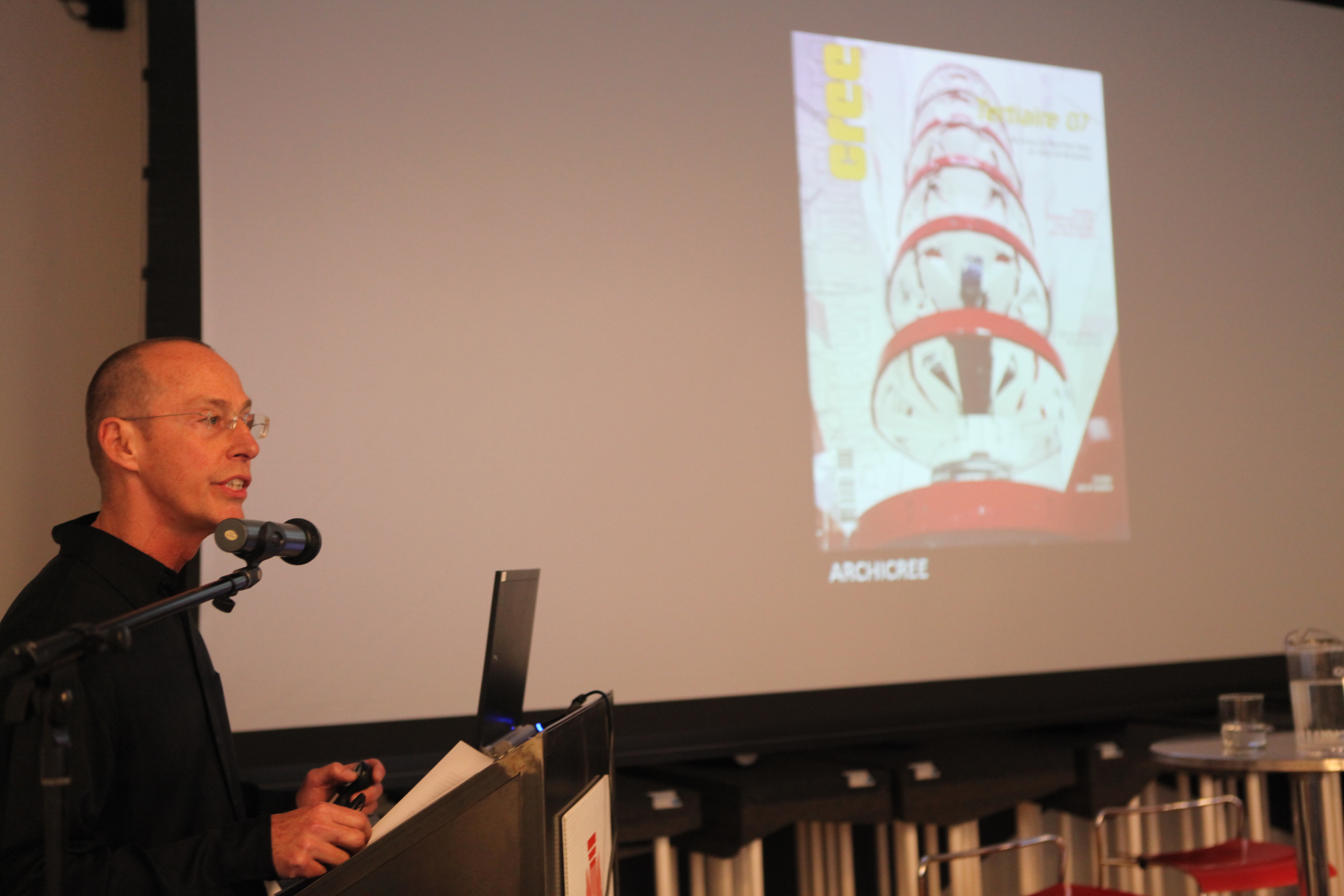
As the U.S. correspondent for the French publication Archicrée, Self had been to many of the museums prior to writing his book, then visited the remaining museums and met with their directors to complete the new volume. Each chapter follows an identical template; starting with an overview, the essay moves through the design process with plans and sections, and ends with a telling detail. The consistent methodology makes it easy to compare museums and to highlight their differences.
Within the museum typology, Self identifies several approaches to display, itinerary, fatigue, and lighting. Exhibition spaces manifest as large halls or lofts, as in Spacelab Cook/Fournier’s Kunsthaus Graz, which hosts a variety of traveling exhibitions, or as more intimate rooms that house pre-defined collections, like Sauerbruch Hutton’s Museum Brandhorst. Museo Nazionale Delle Arti Del XXI Secolo (better known as MAXXI) by Zaha Hadid Architects employs traditional long galleries in an amalgam of “free space that induces a flow at the expense of repose and focus.” Conversely, this itinerary, or movement through the museum, can be a singular path, as in Bernard Tschumi Architect’s Acropolis Museum, where the museumgoer’s path is a prescribed spiral.
Two approaches to counteracting visitor fatigue include introverted museums cut off from external influences, such as the Museum of Modern Art and its addition by Yoshio Taniguchi and Associates, or extroverted like Diller Scofidio + Renfro’s Institute of Contemporary Art/Boston, where circulation spaces line the perimeter. Linked to lighting approaches, Shigeru Ban and Jean de Gastine’s Centre Pompidou Metz has “simple galleries viewing monuments” in the landscape, and Renzo Piano Building Workshop’s museums are essentially “roofless” to allow natural light into the galleries. The most extreme is Kazuyo Sejima + Ryue Nishizawa SANAA’s Toledo Museum of Art Glass Pavilion, “whose elevation consists of five horizontal lines” to become part of the landscape and exploits natural lighting to the fullest. Luckily, their collection is largely inert glass.
Self similarly analyzes the museums of Coop Himmelb(l)au, Herzog & de Meuron, Ateliers Jean Nouvel, Steven Holl Architects, Studio Daniel Libeskind, and Tadao Andao. While Self picked the first decade of the new millennium because it was a time of high aspirations, he’s sure there are more to come. Self read an article from a 1938 issue of L’Architecture d’Aujourd’hui indicating that era was a peak for museums, concluding, “every period is THE period of museum construction.” Regardless, Self’s The Architecture of Art Museums will remain essential to archi-tourists and museum designers alike.
James Way, Assoc. AIA, Marketing Manager at Dattner Architects, frequently contributes to eOculus and spends a lot of time in museums.
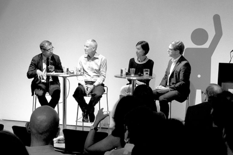
Event: The Architecture of Art Museums: A Decade of Design, 2000-2010
Location: Center for Architecture, 21.05.14
Speaker: Ronnie Self, Associate Professor of Architecture, Gerald D. Hines College of Architecture, University of Houston
Organized by: AIANY Cultural Facilities Committee
