For architects, housing the disabled poses myriad problems, which vary according to the type of housing. The challenge may be least daunting when designing for a specific resident whose disabilities are already known (as in the case of a single-family house), and most daunting when designing for a range of occupants whose disabilities will vary widely (as in the case of a hotel room).
Some products designed for the population at large have proven especially helpful to the disabled. Devices that interpret and carry out voice commands, such as Google Home, are a boon to people who can’t reach or manipulate conventional switches and thermostats. For a person with a hearing impairment, slightly more esoteric systems will translate sounds—someone knocking at the door, a dog barking, an appliance turning off—into visual alerts on smartphones, computers, or TV screens. And with the right hardware and software a person can see who’s at the door, then open it and close it with spoken commands.
For the sight-impaired, a smartphone with an app that translates print into speech can be particularly useful for getting around. Pointed at a sign, it can read the sign aloud. A phone pointed at a person may even be able to identify the person.
A HOTEL ROOM IN A BASEMENT INNOVATION LAB
But there is more to life than apps. Much of what the disabled need isn’t technology but compassion and common sense, according to a number of architects and consultants. And not every effort to accommodate the disabled has to be a big one. “You can make a series of small changes that together have a huge overall impact,” says Alex Ahulwalia, the senior vice president of global operations for Marriott. Ahulwalia is responsible for the guest experience at some 7,000 hotels (marketed under 30 different brand names in over 100 countries). Last summer he oversaw a deep dive into making those hotels more accessible, an initiative that arose from, among other things, he says, “the desire to serve a market that may be underserved.
The effort included building a mock-up of an accessible guest room in the basement of the company’s Bethesda, Maryland, headquarters, known as the Innovation Lab. Dubbed “Room for All,” the project involved the participation of Marriott’s global design department, as well as experts from operations, technology, customer service, and multicultural affairs. The objective, Ahulwalia says, was to come up with ideas that are scalable and would work at every market segment, from the high-end Ritz-Carlton to the mid-market Sheraton to the more affordable Springhill Suites.
The project was not only “focused on meeting the legal requirements of the ADA,” he says, but also on enhancing the experiences of guests with a variety of disabilities, including mobility, hearing, vision, and sensory impairments. Before constructing the model room, Ahulwalia worked with outside organizations, including Disability:IN, to identify customers with a range of issues. “We actually went to their homes to look at how they used their living spaces and bath spaces,” says Ahulwalia. Later, the customers were invited to visit the mock-up room and provide feedback.
Among the issues the rooms addressed, Ahulwalia says, was the allocation of square footage—for instance, whether the bathroom should be bigger, relative to the bedroom. For mobility, thresholds were widened and some swinging doors were replaced with sliders. The Room for All considered various bed heights and vanity heights, and the possibility of using reaching tools to make closets more accessible to people in wheelchairs and those of short stature. They took into account the accessibility of soap, towels, toilet tissue, and other necessities.
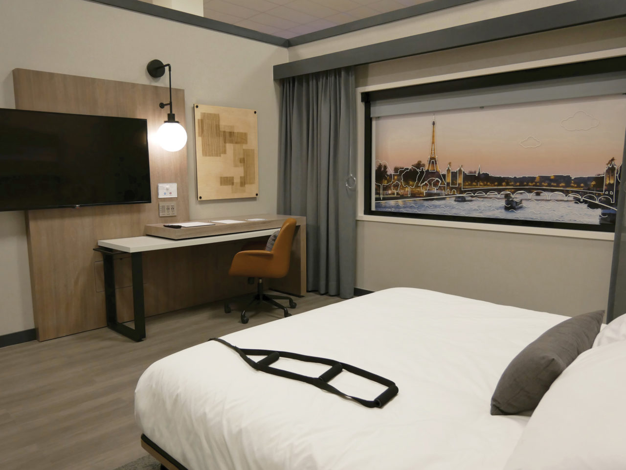
Then they investigated materials. How does a low-pile carpet versus a thick-pile carpet affect guests in wheelchairs? A consistent flooring material may be best for maneuvering wheels, but changes in material can help guests who are blind know where they are in the room. Even changes in wallpaper texture can be a wayfinding tool. The Room for All contained some high-tech features, including windows and window shades that follow voice commands, as well as voice-activated thermostats. Domestic “voice assistants” can be adapted to hotel use at relatively low cost. Other high-tech features, like doors that swing open at a touch or voice request, might be helpful to some guests but are expensive to buy, install, and maintain.
Making rooms accessible means not just adding features, but training employees to use and explain them. “Design and technology work together with customer service,” says Ahulwalia, who notes that his team is looking at “how employee training across the company can build more empathy and knowledge.”
Some tech features are even designed to help guests long before check-in. Websites with audio and video components, Ahulwalia says, can provide better information at the start of the booking process to help customers find rooms that meet their needs and eliminate surprises on-site. “It’s also important to connect our guests to our hotels before they arrive to reduce anxiety,” he says. “Early communication can make a big difference.”
The goal isn’t to make every room fully accessible. “I don’t think all rooms can meet all needs,” he admits. Even simple things like shower grab bars, he says, “don’t need to be in every room around the world.” (The company has more than 1.3 million rooms.) Instead, he says, “our goal is that, whatever preference a guest has, it should be available to them.” The project will lead to test rooms in several Marriott hotels as early as this year. “Only with a real market test can we see what resonates and what really makes a difference to our guests,” says Ahulwalia, adding that the rooms will be in hotels that represent the company’s demographics and stylistic range.
Hotel guests might not even know they’re in a room designed to accommodate disabilities.
AN APARTMENT THAT DOESN’T LOOK ACCESSIBLE, JUST MODERN
David Carmel isn’t the typical quadriplegic. Twenty years after a diving accident in Mexico left him paralyzed from the chest down—but with arm and limited hand function—he still uses a self-propelled wheelchair. Carmel says it helps him maintain upper-body strength and is lighter and more maneuverable than motorized chairs. “Yesterday I visited my daughters’ school,” he says. “There were a ton of steps, but a couple of guys were able to lift me. With a 200-pound power wheelchair, that couldn’t have happened.”
In the last few years, Carmel, who is 46, has used a power-assist wheelchair that, like a power-assist bicycle, provides a little boost. A biotech executive, Carmel lives with his wife and two children in an Upper Manhattan apartment that was modified for them by architect Garrick Jones of the Brooklyn firm Ten to One. (The name, according to the studio’s website, “refers to long odds.”) Jones also helped design Carmel’s previous home, a bachelor pad in Chelsea. The Upper Manhattan building is entered at grade level through motorized doors. That kind of universal design, Carmel says, “doesn’t just help people in wheelchairs or people with walkers; it helps people with grocery bags.”
When he was living in Chelsea, he recalls, his building installed an automatic opener for the front door. “Someone said, ‘We’re wasting all this money for one person who’s in a wheelchair.’ I said, ‘Just watch how many people benefit.’ I’m hoping that as the population ages, people will be more cognizant of the benefits of accessibility more broadly.”
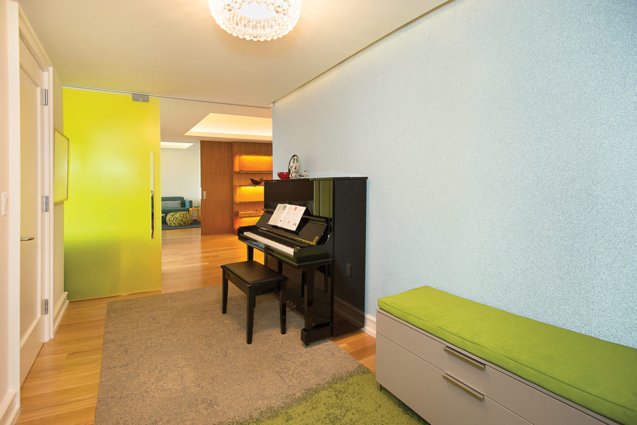
The design of the Carmels’ light-filled apartment is more about graciousness and ease of movement than about specific accommodations. “We’ve tried to make it an apartment that is very accessible but doesn’t look it,” Carmel says. Adds Jones, “Working for David, I found that if you follow the minimum requirements, it isn’t comfortable. With legally permissible 32-inch openings between rooms, he would feel like he was just squeezing through.”
Instead, Jones enlarged most of the openings—one is now eight feet wide, which turns the dining and living rooms into a continuous (but subdivided) space. “I found it a great opportunity to take a very compartmentalized New York apartment and blow it open,” Jones says. “You can really create fun spaces, much larger social spaces, than you would otherwise have. It essentially became a flexible loft space. And it led to a minimalist, modern aesthetic.”
Where it was necessary to have doors that close, Jones opted for sliders and made them out of resin so that light would pass from one room to another. And there are no doorknobs; levers are much easier to operate.“I hope the doorknob goes the way of the dodo,” says Carmel, smiling. Throughout the apartment, there’s nothing on the floors that’s hard to get a wheelchair over. Window shades are remotely controlled. The family has a Google Home device, which was provided by the Christopher and Dana Reeve Foundation in partnership with Google. Carmel uses it to listen to music, check the weather, and perform Web searches. He explains that, for people with limited hand function (and probably people with full hand function), “It’s faster and easier to just speak what you want.” But overall, he notes, the apartment is “pretty low-tech.”
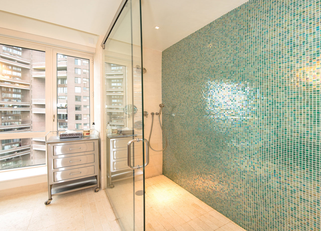
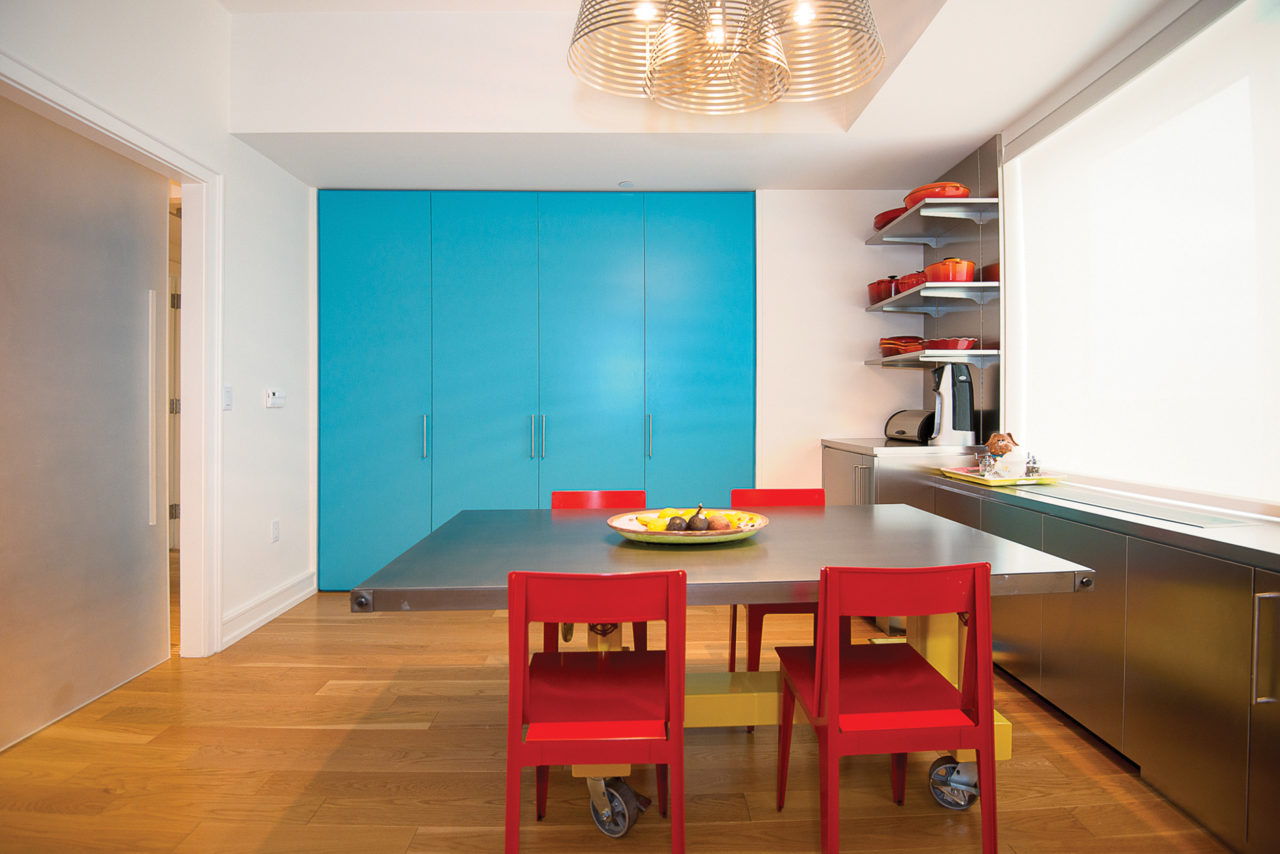
There is a special bathroom with a cantilevered sink (“The ability to roll under the sink is a biggie for me”) and a roll-in shower without any kind of threshold, or “saddle,” to hinder a wheelchair. And the kitchen was custom-designed, with work surfaces that are “easy to get underneath and easy to get around,” Carmel says. There’s an extra fridge that’s convenient for him to use, and low-to-the-ground cabinets and drawers.
Asked what advice he would give architects, Carmel says, “No one can expect to be able-bodied forever. Even if your clients are 20-somethings, they might someday encounter issues. Why have narrow stairs and narrow doorways when you don’t have to?” Instead, he says, architects should design spaces that are accessible to all people and “stand the test of time.” Jones says he finds Carmel’s needs not a limitation, but an inspiration. And the kinds of things he did for the Carmels, he says, “I try to do for all my clients.”
A MANHATTAN HAVEN FOR THE BLIND AND PHYSICALLY DISABLED
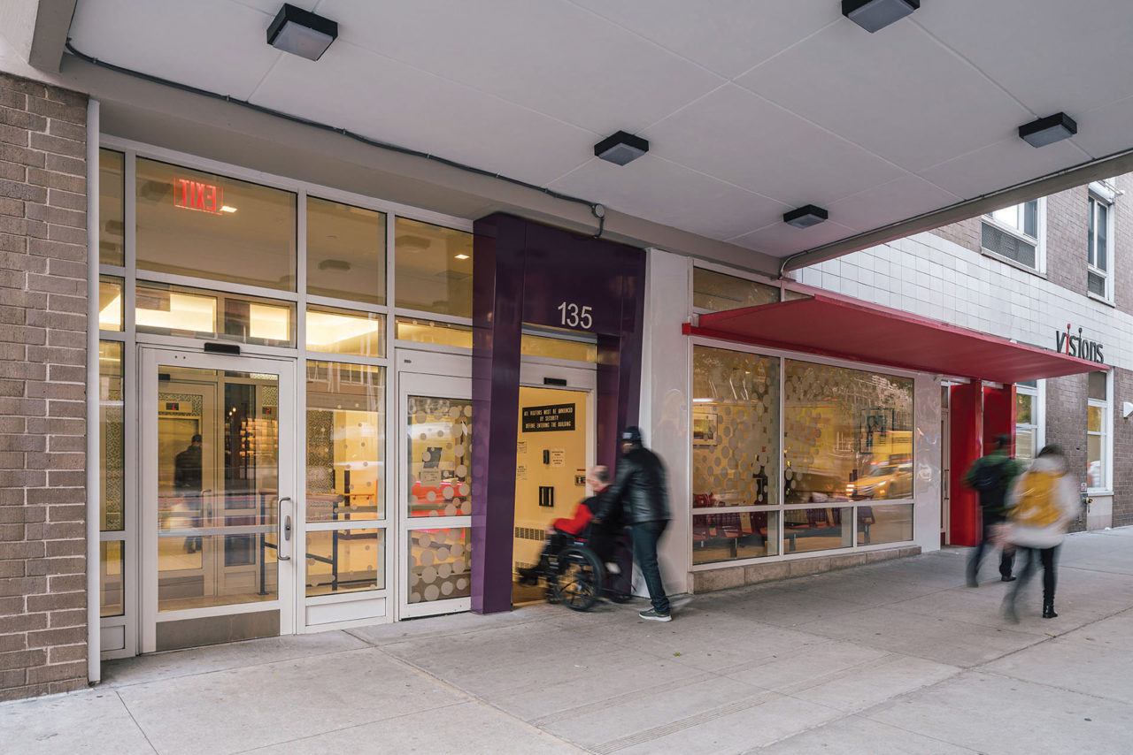
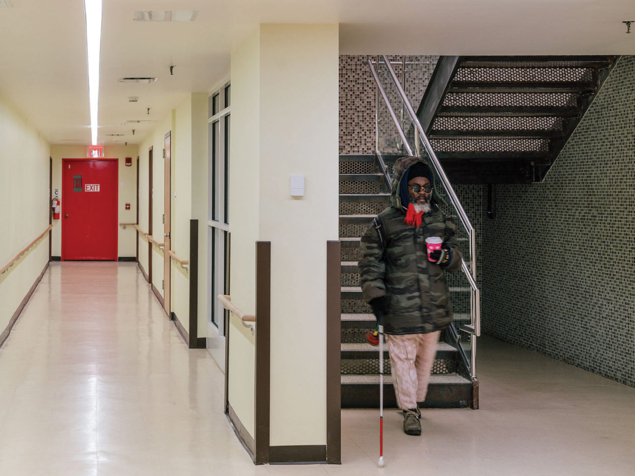
Magnusson Architecture and Planning, a 33-year-old Manhattan firm, was hired by the owners of Selis Manor, a 205-unit apartment building serving the blind and physically disabled. (According to the New York Times, the West 23rd Street building was financed by the U.S. Department of Housing and Urban Development and built by Irving M. Selis, a blind newsdealer. It opened in 1980, turning “a small slice of Manhattan into something of a haven for the blind and visually impaired.”) Magnusson undertook a plan to upgrade the entire building for the first time in its history. Because the renovation was conducted two floors at a time, with residents remaining on the other floors, “we got a lot of real-time feedback,” says Sara Bayer, AIA, the firm’s director of sustainability and one of its experts on accessibility.
The feedback led to granular improvements. Where wooden living room floors met vinyl kitchen floors, Bayer provided wooden “transition strips.” They were ADA compliant, but some wheelchair-bound residents (especially those in motorized chairs, which have small front wheels) found the strips too thick to easily roll over. The wooden strips were replaced with thinner strips of metal. Choices of materials, Bayer notes, are particularly important to the disabled.
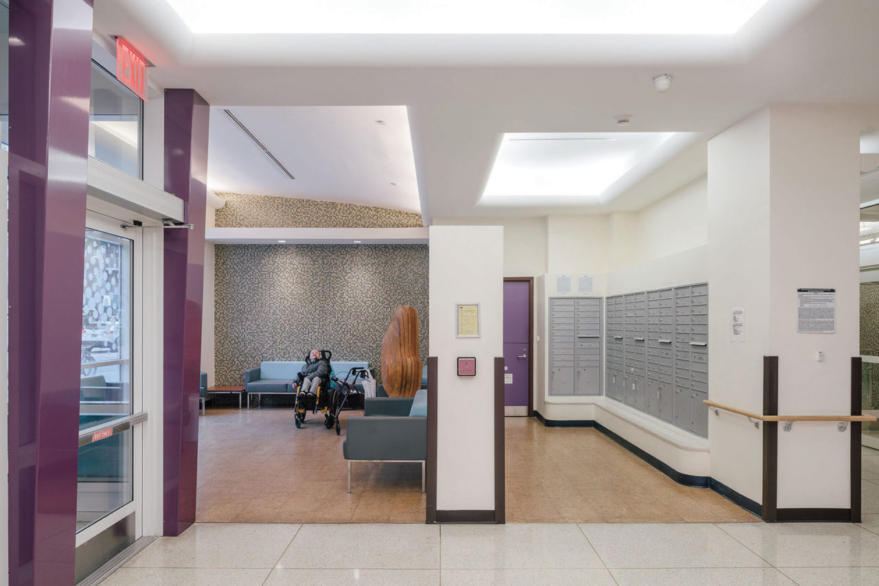
So is circulation. The building houses Visions, an organization that provides services for the blind and visually impaired. Visions used to share the building’s main entrance, leading to confusion and crowding in the residents’ lobby. As part of the $37 million renovation, Visions got its own entrance and elevator. The architect moved the laundry room from the basement to the ground floor, positioning washers and dryers so that their controls are easy to reach, and repurposed a rear courtyard as a place for residents to congregate. “All those things make people’s lives much better,” Bayer says.
The building’s front doors open at the touch of a button. The lobby seating area and security desk are bright and modern. Along each hallway, destinations like the elevator bank are indicated with a change of wall color and floor texture.
“There are some nice moments,” says Bayer, adding, “Without a big budget, you have to think about physical solutions, not a lot of bells and whistles.” Bayer could be speaking for anyone who designs housing for the disabled, whether it’s one room or, as in the case of Marriott, thousands of rooms around the world
