My daughter is growing out of her stroller now, but when I see other parents lifting strollers up and down the subway stairs daily, I remember what it felt like to be excluded from a comfortable experience of the built environment. Taking a stroller down the subway stairs means risking everyone’s safety and inconveniencing passersby while sticking out like a sore thumb. Any born-and-raised New Yorker knows working subway elevators are very few and far between. If you do happen to find one, using it typically involves diverting your path and taking a strange, lonely route.
Now that my daughter is walking, we’ve rejoined the stair-climbing society. But my time as a stroller-dependent person in this city inspired deeper thought about how the built environment can create powerful feelings in us. Feelings of inclusion, acceptance, and normalcy and—conversely—of separation, segregation, and ostracization.
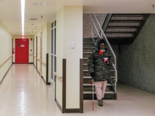
Through my many years at Spacesmith, I’ve been witness to and helped make architecture that I think of as genuinely accessible—welcoming all of humanity and creating an equal playing field for all its diverse user groups and occupants. To me and my colleagues, genuine accessibility doesn’t just mean that a person who might be wheelchair-bound, blind, or deaf can navigate a place. It means he or she can navigate it with as much dignity, effortlessness, and feelings of belonging as everyone else. We like to create places that are as much for underrepresented individuals as they are for the general public.
Underrepresented populations don’t include only the physically handicapped, but also people of foreign cultural backgrounds who may not understand our common languages or wayfinding systems. They also include emotionally and psychologically challenged individuals, and students with learning differences.
Universal design principles are a great resource and guide for me and my colleagues, who strive to realize functionally and socially inclusive spaces. They’re integral to creating genuinely accessible and equitable architecture. At Spacesmith, we apply universal design to almost every typology—including retail spaces, classrooms, workplaces, and government agencies—because it yields such positive results for all user groups, based on the feedback we solicit. Recently we completed a handful of successful institutional buildings where these design principles served as foundation and parti.
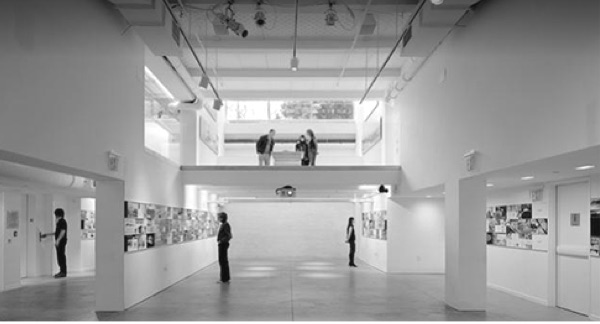
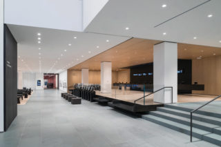
For the School of Visual Arts’s new Design for Social Innovation Department in Manhattan, we were challenged by school leaders to examine the distinctions that create separations, and work to eliminate labels, silos, and boundaries. In response, we removed and transformed the physical and visual separations within the space. The exterior walls of one area become the interior walls of another, providing storage, a visual connection to natural light, or writing, thinking, and drawing surfaces.
Instead of being prescriptive about how educational spaces should feel and be used, we designed it flexibly to allow students, faculty, and visitors to adapt their environments to their needs and desires. It’s a live-and-let-live approach to design that has proven truly effective from both a functional standpoint and the more subtle perspective of creating a sense of empowerment among all users.
Another major guiding principle for us in creating accessible, inclusive architecture is what I would describe as designing to meet the “lowest common denominator,” meaning that we find the most exceptional (and restrictive) standard, and stick to that in every instance throughout a project. Holding to those exceptional standards everywhere, not only as required, helps us create more equitable, inclusive, and forgiving architecture.
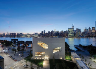
How? For example, although Americans with Disabilities Act (ADA) standards might require larger-size bathrooms or lower-height tables to accommodate wheelchair occupants, we design every project element to those standards so that a built-in seamlessness emerges in the experience of the place. The benefit is that wheelchair users won’t feel singled out by having to sit at a special table or use a special bathroom, because all tables and bathrooms are open to them. This is how, working with Dattner Architects, we’ve created a welcoming ambience in all the public space interiors for residents at the new 10 Halletts Point in Astoria, Queens.
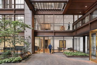
In some cases, however, it’s necessary to create separate spaces to ensure inclusion. Recently, Spacesmith designed several new classrooms for Columbia University’s Chandler Hall. To make classroom functions more inclusive, two smaller rooms were designed as dedicated testing areas for students with learning differences. This provides a quieter, calmer, and more intimate testing room for students with documented disabilities. The other larger classrooms, utilized for general classes and lecture halls, feature rows of fixed table systems with seats that rotate 180 degrees so students can easily collaborate. The largest lecture room, holding 125 students, provides better than ADA-accessible seating with improved ergonomics and adjustability and state-of-the-art audiovisual equipment.
At Spacesmith as at other firms, our institutional clients in particular are asking for collaborative group work environments that require mobile, adjustable furniture—but also private spaces for teams to huddle together. Our goal is to accommodate these needs in a socially sensitive way that ensures inclusion and equity. We will keep refining our design strategy to make architecture that is accepting of and functional for all.
William Wong, AIA, LEED AP, has more than 15 years of experience in design, construction, and project management. As a principal at Spacesmith, he is regarded as a leader in project management in the workplace, retail, academic, and non-profit sectors. Recent projects led by Wong include the academic renovation at Columbia University’s Chandler Hall and the public and unit interiors at the mixed-use residential complex at 10 Halletts Point, Queens.

