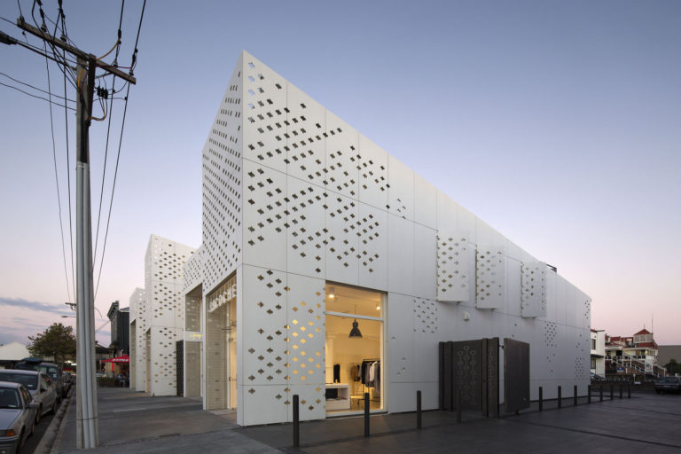
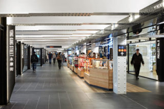
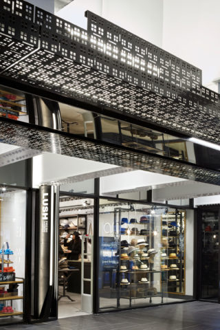
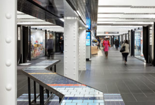
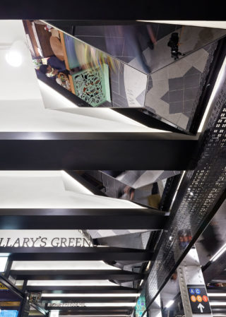
The design is premised on the belief that subway is a unique place where one inhabits the infrastructure under the city and that by celebrating the underground site’s distinct features, we could create an authentic urban place that would draw people and sustain businesses. To achieve this, we first stripped away the familiar MTA paraphernalia and then show-off the century-old beams, columns and vaults with white paint and warm light. Glass storefronts with transoms allow the vaults to pass over stores providing a feeling of spaciousness in the tight passageway. New functional elements defer to existing infrastructure and reference classic subway features. The decorative metal “spine” screens pipes, conduits, and devices with openings derived from the station’s historic tile patterns. Floor paving, arranged in a herringbone pattern to refer to the Gustavino tiles in Grand Central Station. New custom "light pipes" at entry ceilings are perforated tubes around LED strips integrated with the tangle of existing station conduits to further blur the line between architecture and infrastructure. The intentionally small stores allow for a diversity of businesses. Each is identified with illuminated blackened steel signs carefully detailed to be experienced up close by pedestrians. Places where people pause to eat, talk, or buy something are highlighted with colorful flooring, kiosks and tables. Interactive electronic columns, as physical objects and in their digital curation, further contribute to the vitality of the environment. These features, derived from the city’s sidewalks, combine to bring a familiar street-level urbanism to the underground space.
Project facts
Location New York, NY
Architects Architecture Outfit
Year 2016
Project Team BuroHappold Engineering; Lighting Workshop; Urban Projects Collaborative
Category Transportation & Infrastructure
AIANY Recognition
2019 AIANY Design Awards
