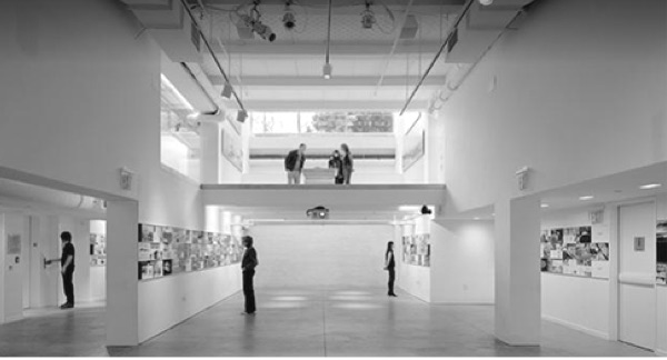
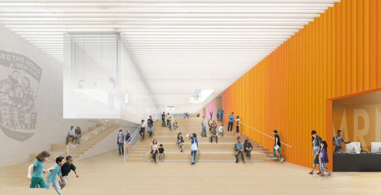
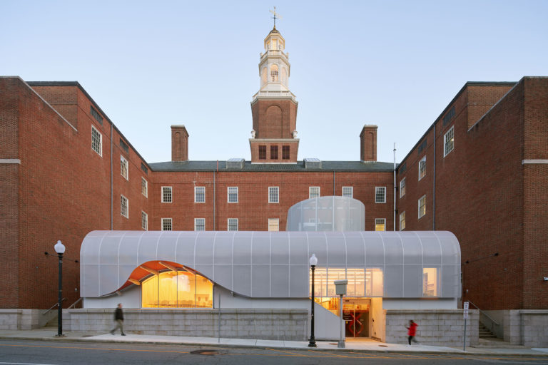
The design for Poster House responds to both the unique qualities of the institution within the cultural landscape of New York City and the urban conditions of its site in the Flatiron district. The design is organized by splitting the existing space into two halves: the galleries to the east and the public passage to the west, but inflects this line of division diagonally through the space. This geometry maximizes space for the main gallery and opens up the public zone, optimizing interface with the street. The result is a single diagonal wall that both divides the space programmatically while linking the 23rd and 24th street sides, guiding visitors through a series of interconnected spaces and providing a surface that accommodates the display of posters. Acknowledging the 23rd street entry, a canopy pivots out from the wall to create a zone of overlap between the two kinds of space, connecting the front door at the sidewalk to the door of the main gallery near the midpoint of the space. Juxtaposing a dynamic urban passage with sophisticated gallery spaces, the design for Poster House seeks to combine the old and the new, the rustic and the refined, the playful and the somewhat serious into a layered but still unified architectural experience. As a museum for the often overlooked and undervalued poster, the space balances contrasting spatial qualities that correspond to the poster’s unique identity as both commerce and art, public information and cultural artifact.
Project facts
Location New York, NY
Architect LTL Architects
Year 2019
Project Team Polise Consulting Engineers; Silman; DTM; J. Callahan; Richter+Ratner; Lumen Architecture
Category Cultural
AIANY Recognition
2023 AIANY Design Awards
2022 AIANY Design Awards
2021 AIANY Design Awards
2020 AIANY Design Awards
